Transforming Workspaces: The Role of Colour in Employee Productivity
Walk into any workspace and you can feel it almost instantly — the tone, the mood, the focus. Some spaces energize you. Others calm you down. Some, unfortunately, make you want to leave.
That invisible influence? It’s colour.
From corporate offices in downtown Winnipeg to coworking studios in the Exchange District, businesses are discovering that the right paint colours don’t just make walls look good — they directly impact how people think, feel, and perform.
Here’s how commercial painters in Winnipeg use colour strategically to transform work environments and boost productivity.
1. Colour Psychology 101: How Paint Shapes Behaviour
It’s no coincidence that fast-food chains use red and yellow, or that spas lean into greens and soft neutrals. Colour affects emotion and focus on a subconscious level.
In workplaces, colour psychology plays a measurable role in how employees feel and function. Studies have shown that wall colours can influence concentration, stress, and even perceived temperature.
Warm colours (reds, oranges, yellows) stimulate energy and creativity.
Cool colours (blues, greens) encourage calm, focus, and trust.
Neutrals (whites, greys, taupes) provide a clean canvas for brand consistency and visual balance.
Professional painters understand that blending these strategically creates an environment that supports how a team works — not just how it looks.
2. Blue: The Focus Colour
Blue is one of the most popular choices for commercial interiors — and for good reason.
It’s associated with stability, calm, and productivity. Blue tones lower heart rate and create a sense of order, which is why they’re so effective in:
Corporate offices
Accounting or legal firms
Tech companies and development studios
In Winnipeg, where long winters mean plenty of indoor hours, soft blues can counter cabin fever by promoting serenity and sustained concentration.
3. Green: The Balance Builder
Green connects people to nature, even in windowless spaces. It reduces eye strain, boosts creativity, and helps employees feel refreshed throughout long workdays.
For that reason, commercial painters often recommend muted greens or sage tones for:
Meeting rooms
Open-concept coworking areas
Breakout or lounge spaces
When paired with natural light or wood finishes, green tones bring warmth and balance without feeling overstimulating.
4. Yellow: The Creative Spark
Yellow inspires optimism and energy — ideal for creative agencies, marketing firms, and collaborative zones.
But like any strong colour, it needs careful placement. Too much bright yellow can feel overwhelming, while softer buttery or pastel tones add cheer without distraction.
Professional office painters use it strategically on accent walls, entrances, or idea zones, where its energy motivates without overpowering.
5. Red: Power and Passion
Used wisely, red creates excitement and confidence — it can literally increase pulse rate and stimulate conversation.
That makes it a smart choice for social spaces or areas where motivation and activity matter most:
Fitness or training facilities
Cafeterias
Sales floors
Because it’s so strong, most Winnipeg painters use red sparingly as an accent rather than a main wall colour — especially in environments that already have bold branding.
6. Neutrals and Greys: The Professional Backbone
Not every workplace wants bright walls — and that’s okay.
Greys, whites, and taupes are timeless, modern, and flexible. They let furnishings, artwork, and branding do the talking. They’re also perfect for property managers who want a move-in-ready palette for leasing to multiple tenants.
The key is using undertones strategically:
Warm neutrals (beige, greige) create inviting atmospheres.
Cool neutrals (soft greys, crisp whites) signal modern minimalism.
Commercial painters can help select the right shade to maintain brightness under artificial lighting — a big consideration during Winnipeg’s shorter winter days.
7. Colour Zoning for Function and Flow
Beyond individual hues, how you use colour within a workspace matters just as much.
Professional painters can use “colour zoning” to visually define different areas — reception, meeting spaces, quiet zones, collaborative hubs — without physical partitions.
Beyond individual hues, how you use colour within a workspace matters just as much.
Professional painters can use “colour zoning” to visually define different areas — reception, meeting spaces, quiet zones, collaborative hubs — without physical partitions.
For example:
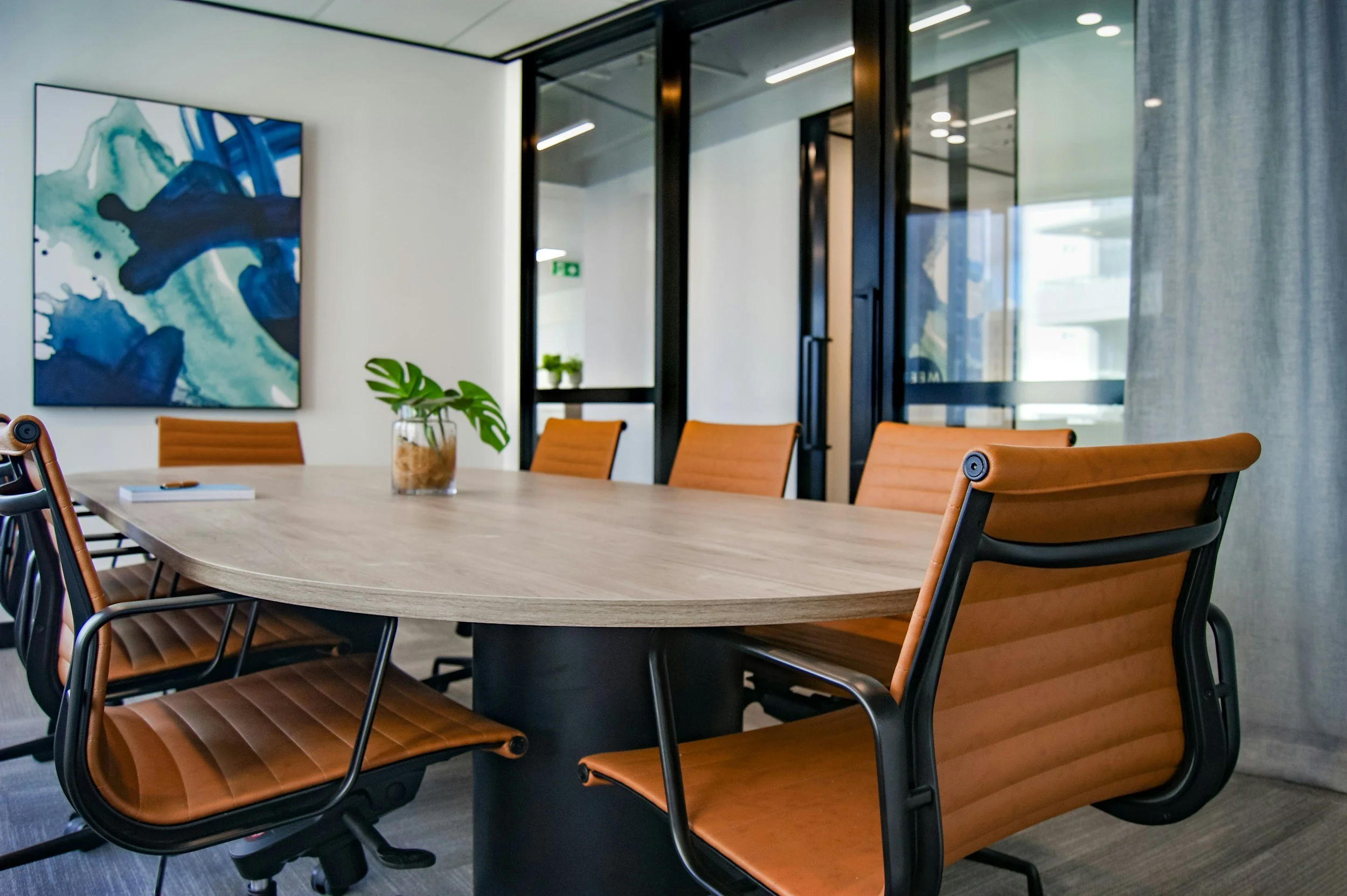
Deep blue in conference rooms = focus.
Green in lounges = calm.
Yellow or orange in creative spaces = energy.
This subtle use of colour psychology supports workflow and movement while keeping the environment cohesive.
8. Reflecting Your Brand Identity
For many businesses, wall colour doubles as brand reinforcement.
Painting contractors in Winnipeg often coordinate with design teams to integrate company colours in subtle, professional ways — think feature walls, branded reception areas, or custom accent patterns that echo a logo’s tones.
When done tastefully, this strengthens brand identity and creates a unified impression for clients and employees alike.
9. Lighting and Finish: The Colour’s Silent Partners
Colour doesn’t exist in isolation — lighting and paint finish can completely transform its appearance.
In offices with fluorescent or LED lighting, a colour may appear cooler than expected. That’s why professional painters test swatches under actual lighting conditions before final selection.
The finish also matters:
Matte softens glare and reduces reflections for open spaces.
Satin or eggshell adds a gentle sheen for durability without harsh shine.
Gloss highlights accent features but should be used sparingly.
These details ensure that the chosen palette looks intentional, professional, and consistent across the entire property.
10. The Winnipeg Advantage: Painting for Climate and Light
Winnipeg’s long winters and limited daylight hours make colour selection even more critical.
Lighter, warmer tones can counteract seasonal dullness, keeping spaces inviting through the cold months. Professional commercial painters in Winnipeg understand how to balance tone, brightness, and finish to keep offices feeling vibrant and productive year-round.
The Bottom Line
A new paint job can do more than refresh a space — it can reshape how people feel and work within it.
By understanding how colour impacts mood and productivity, professional painters transform Winnipeg workspaces into environments that inspire focus, creativity, and collaboration.
Because when your space looks better, your team performs better.

